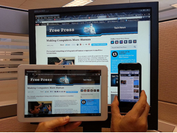
People consume online content via three screens: desktop, mobile phone and tablet. Given the proliferation of each, marketers should build their programs to accommodate all three. Consider the statistics:
- More than 50% of mobile subscribers own a smartphone.
- 25% of Americans own a tablet, as of October 2012.
- The combined installed base of smartphones and tablets should exceed PCs globally by the end of 2013.
That said, consumers interact with each device differently, and screen dimensions play a large role in preferred content, layout and presentation. So, how can marketers ensure that their content is in the proper format—regardless of how it’s being accessed?
 Google recommends responsive design, in which the site detects the device and size of screen, and then automatically sizes the content to fit. For a quick overview, check out What the Heck is Responsive Design? by John Polacek (@johnpolacek), or these examples of responsive design in action from the Disney Store, Boston Globe and more.
Another option, although less preferred, is to have a separate mobile website with its own URLs. In the words of my PR 20/20 colleagues in Do I Need a Mobile Website, “if you aren’t debating whether to launch a mobile version of your website, you might want to start.” They recommend assessing your site analytics and overall user experience to make a case.
But, What’s Next?
As Pete Cashmore (@mashable) detailed in the Mashable Variety Show at SXSW, the number of screens people use to access information is only going to increase. Screens are going to get smaller, larger, on our bodies, etc. A few examples he shared include:
- Smart TVs: Apple is working on a new, high-resolution TV set with its software embedded within it that could be a game-changer. For news and rumors about the iTV, read this TechRadar piece.
- Watches: Pebble created a watch that acts similar to your smartphone. The product launched in January, after the company raised $10.3 million, as a Kickstarter campaign. Apple and Samsung are supposedly working on watches as well.
- Google Glass: This wearable screen worn on the face is designed to seamlessly integrate with day-to-day life. Watch the full explainer video from Google for all the details.
- Flexible Screens: At CES 2013, Samsung displayed a flexible screen technology that can be folded and manipulated.
While many of these technologies are just in the prototype phases, the implications they could have on how people consume information and interact with content are profound. As we’ve seen with smartphones and tablets, this trickles down into how marketers do their jobs.
For me, innovations like these reaffirm my belief that technology and marketing are only going to become more intertwined. It’s up to us to stay abreast of the trends, evaluate implications on marketing strategy and adapt.
What strategies are you using to succeed in the era of multiple screens? What tech innovations have you seen that that could disrupt how people communicate? Share your thoughts in the comments below.
About the Author: Tracy Lewis is an inbound marketing consultant with PR 20/20, a certified Gold HubSpot partner and inbound marketing agency that combines content, public relations, social media and search marketing into integrated campaigns. She is also the community manager for Marketing Agency Insider, the hub for agency news, information and resources.
Image Source: IntelFreePress

 Earlier this month, Gartner released its
  The future of marketing belongs to the hybrids.

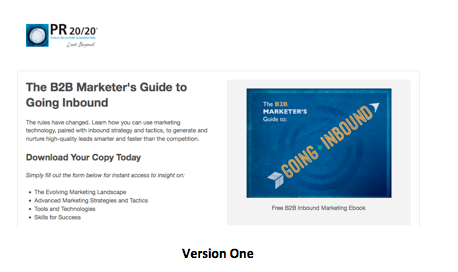
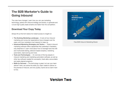
 As you’ll see, in both pages, copy length was the only variable that changed. Other factors, such as headline, image and form remained consistent.
 From here, we set up smart lists that automatically tag contacts as either a “company” or “agency” within our HubSpot portal. Audiences then receive tailored emails based on their status.